Timesn Reversed
Problem & Solution
Side legibility exploration project which is based on the famously known font Times New Roman.
Text
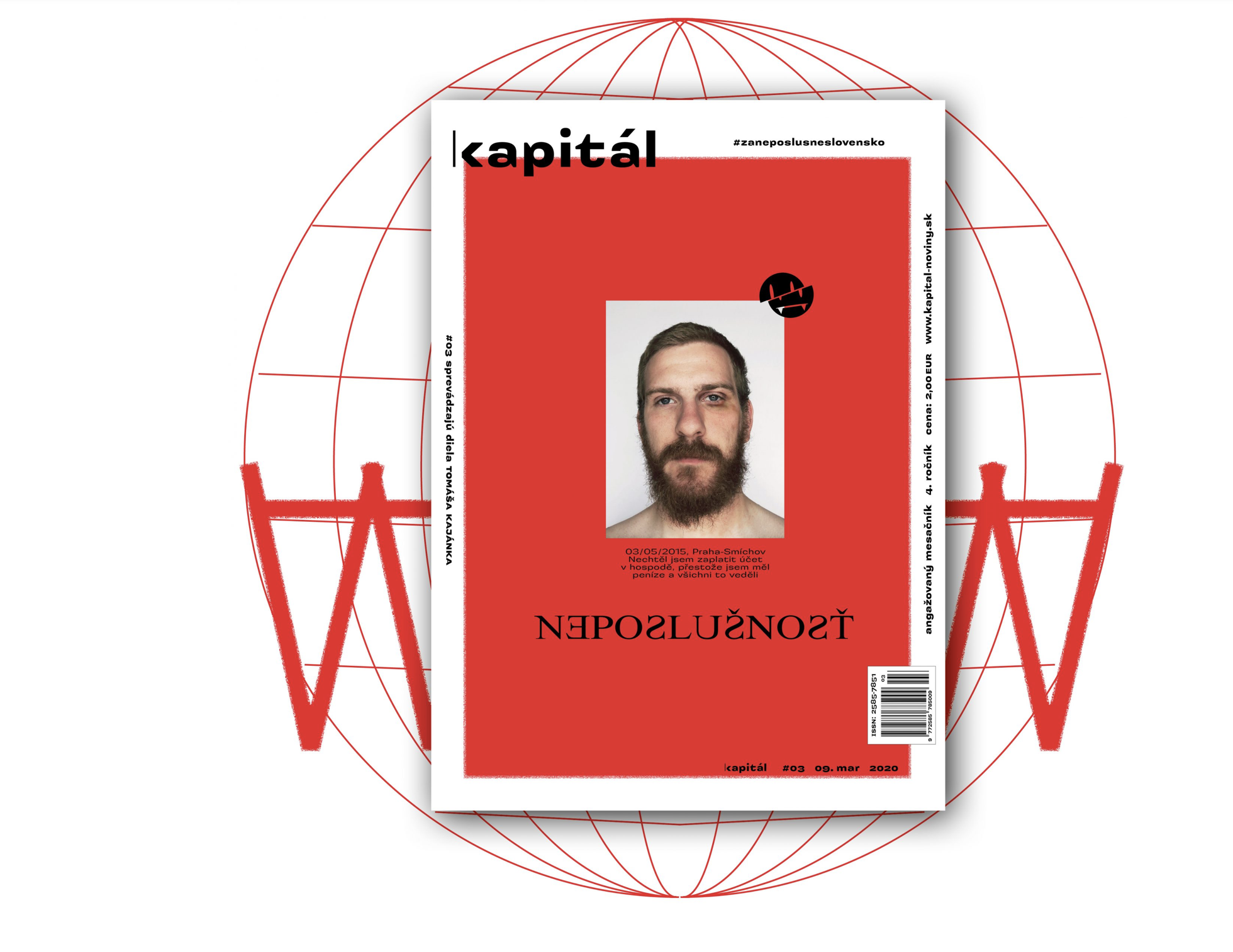
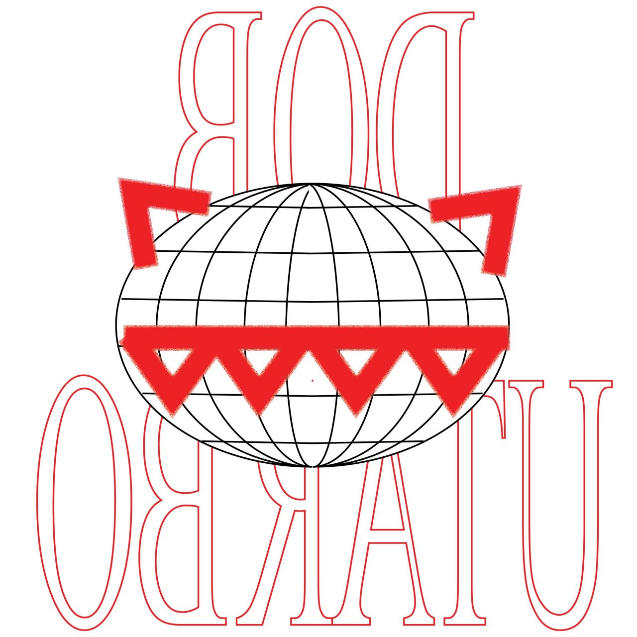
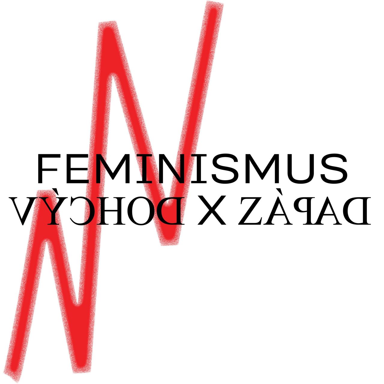
[1] The open project started as a free design exploration of the Latin-based writing system legibility possibilities. It is a naughty version of the well known Times New Roman. Simply by mirroring all its characters, but preserving the left to right reading flow, it creates another view on the typeface usability. Times New Roman – grandfather of the overused serif fonts – gets other visual options, has new metrics and also new reversed kerning. It is open for collaboration or suggestions. In the current state of the design, reversed glyph set – kerned – includes basic Latin charset, Latin Pro & Latin Extended. [2] The font in use by Šimon Chovan {for the Kapitál Newpaper}.


