Mojša therapy
Problem & Solution
Creating an open visual communication concept, thinking about a logo for a small physiotherapy studio, ideas for online communication, prints.
Introduction
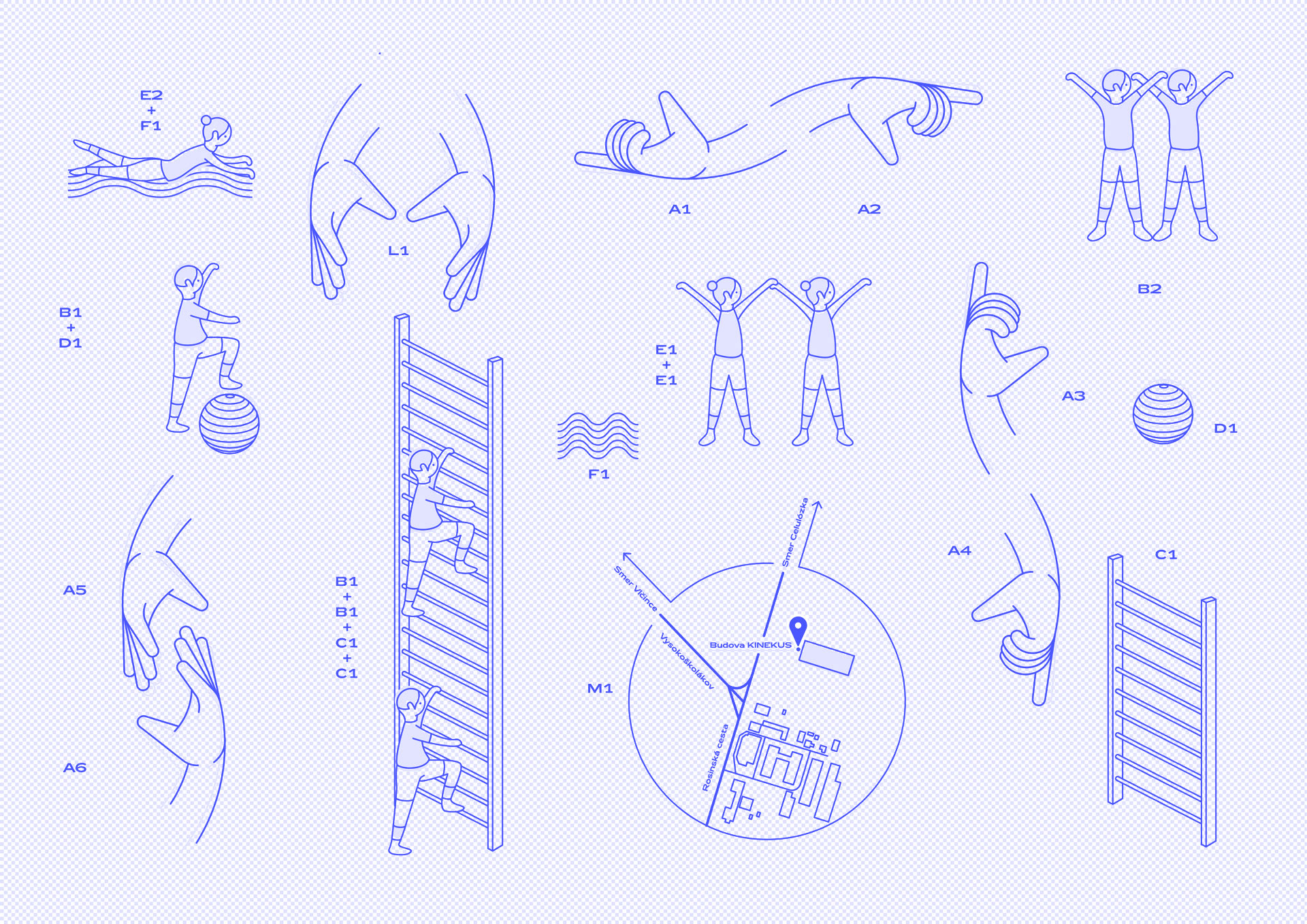
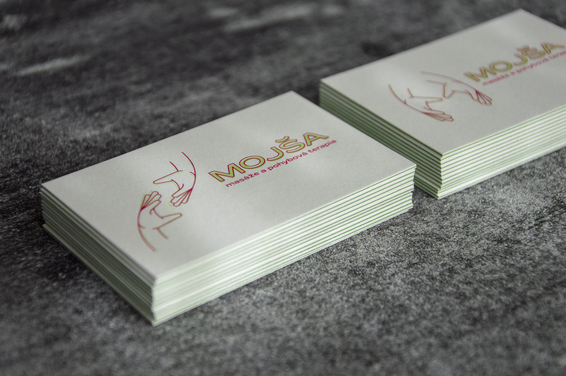
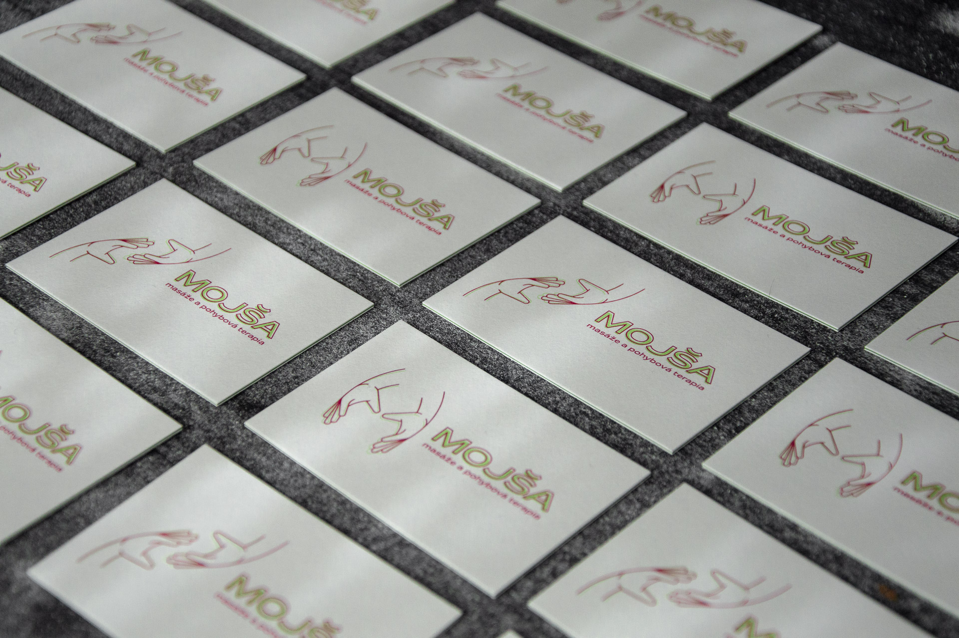
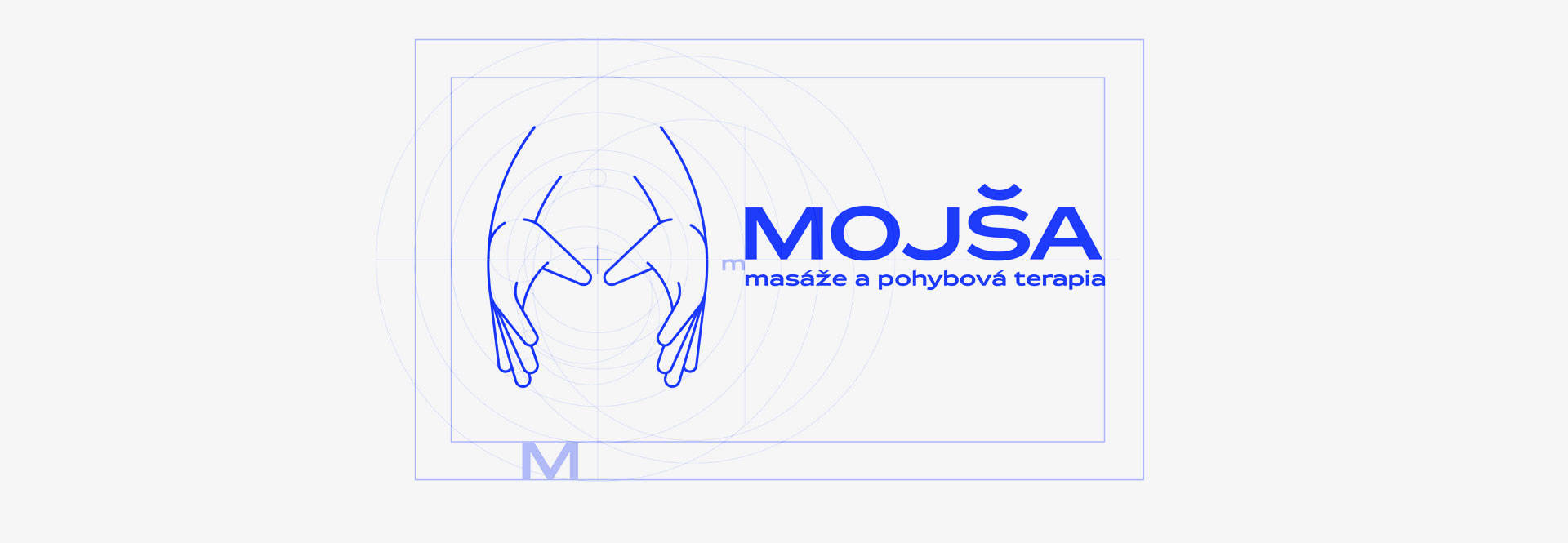
Mojša is a small Slovak therapeutic studio specializing in professional massage, motion therapy, and physiotherapy. Their advantage is an individual approach to the patient and long-term experience from various fields of medicine. While preserving the original name of the company, we tried to find a basic symbol or style that could be developed in the long run. The result is not the logo, but rather the art direction and the pictogram package.
Goal
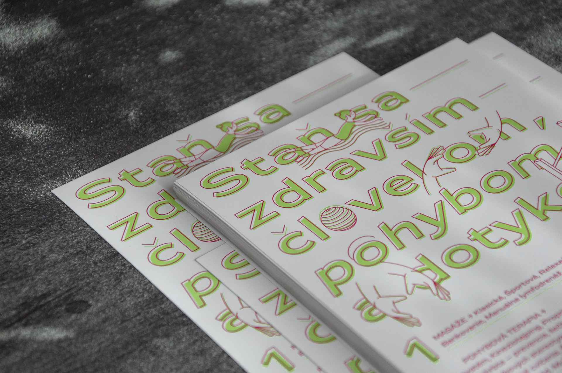
The aim was to create a clearly recognizable and pure communication for the studio. At the same time, it was important for the project to make the studio aware of the work with visual and to create simple communication materials as needed without the help of a graphic designer. Thus, the output is a set of simple pictograms that we can easily multiply, rotate, put into unexpected compositions, creating new meanings. Exhaustion of these options may extend the database again. Related projects: Logos → Veles Wood →
| Client | Mojša studio |
| Varínska tlačiareň |
Logo

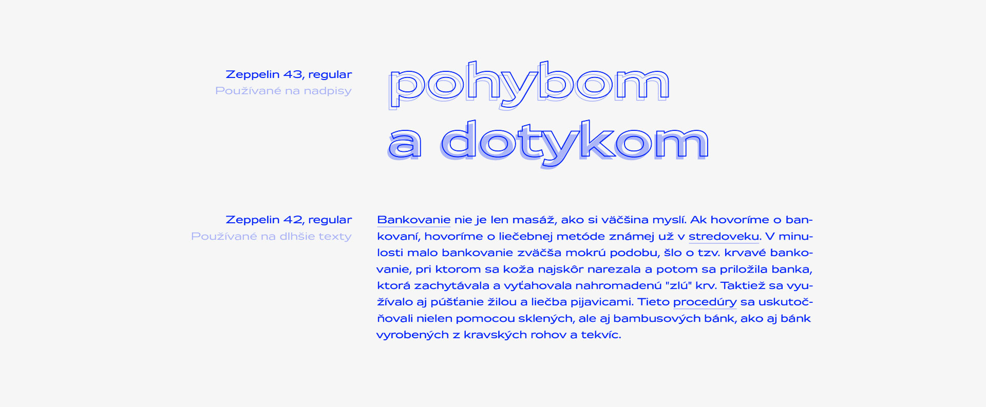
Typography
Ilustrations
